


3
Delta Airlines Amenity Kit
1
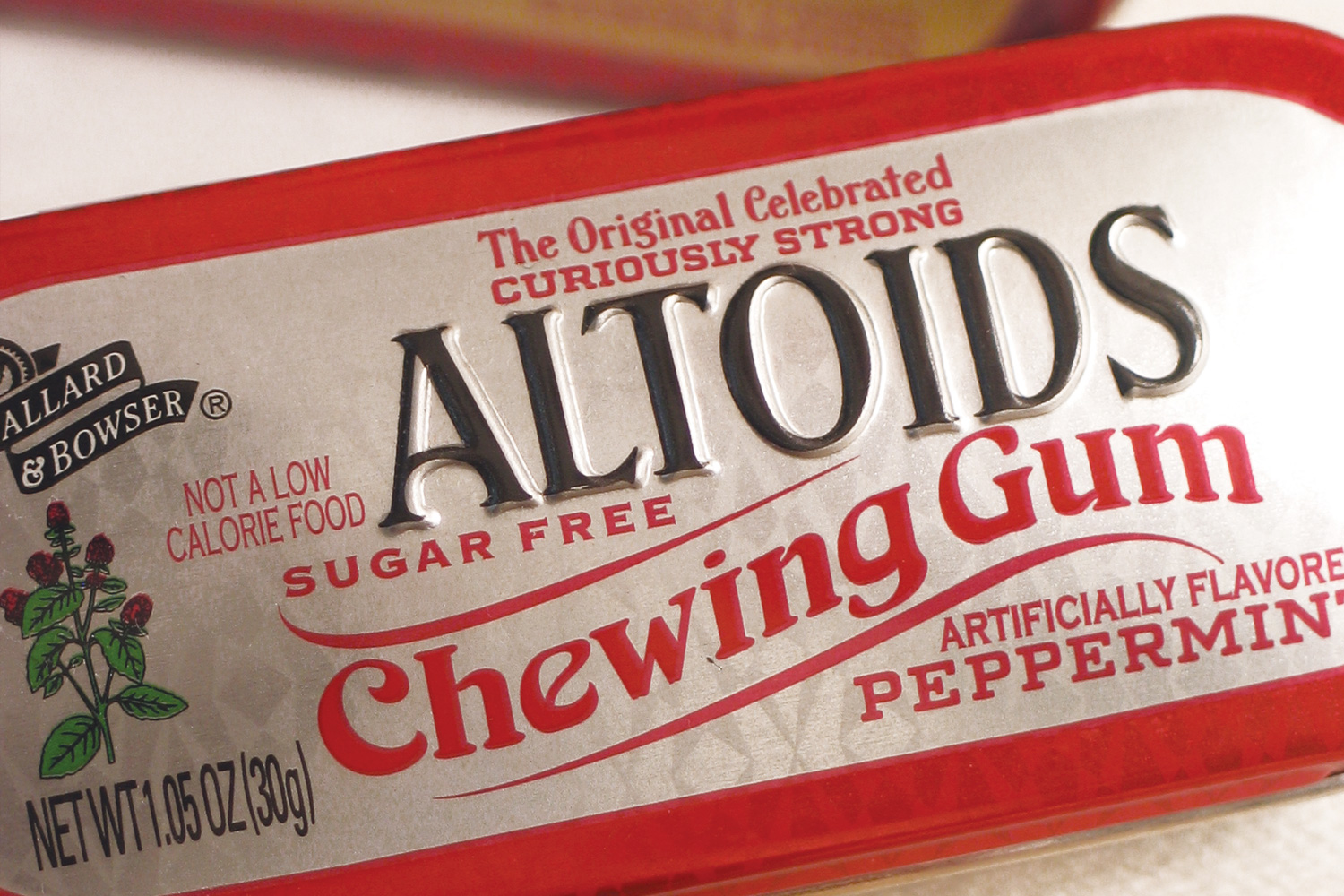
Altoids Chewing Gum
2
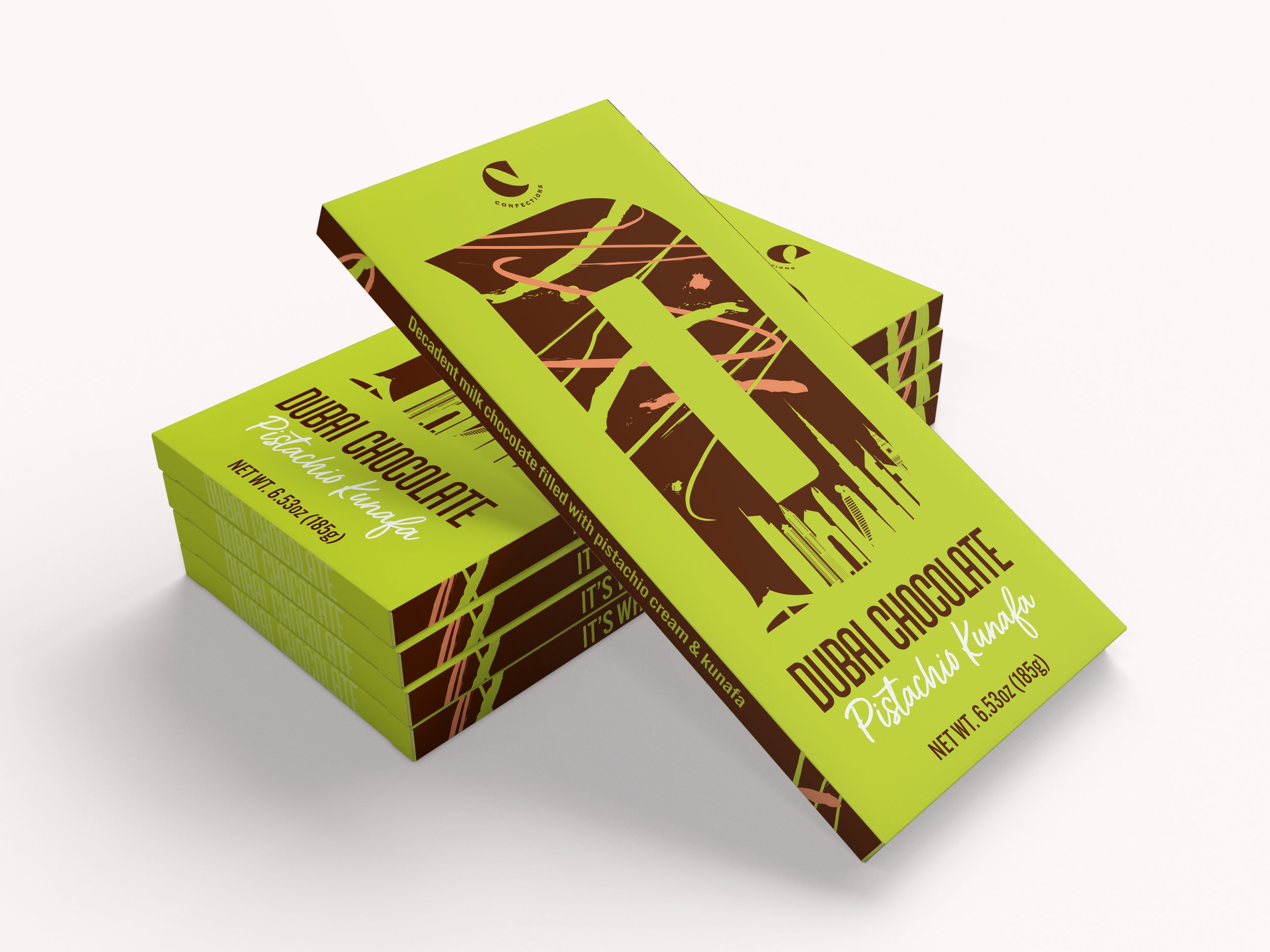
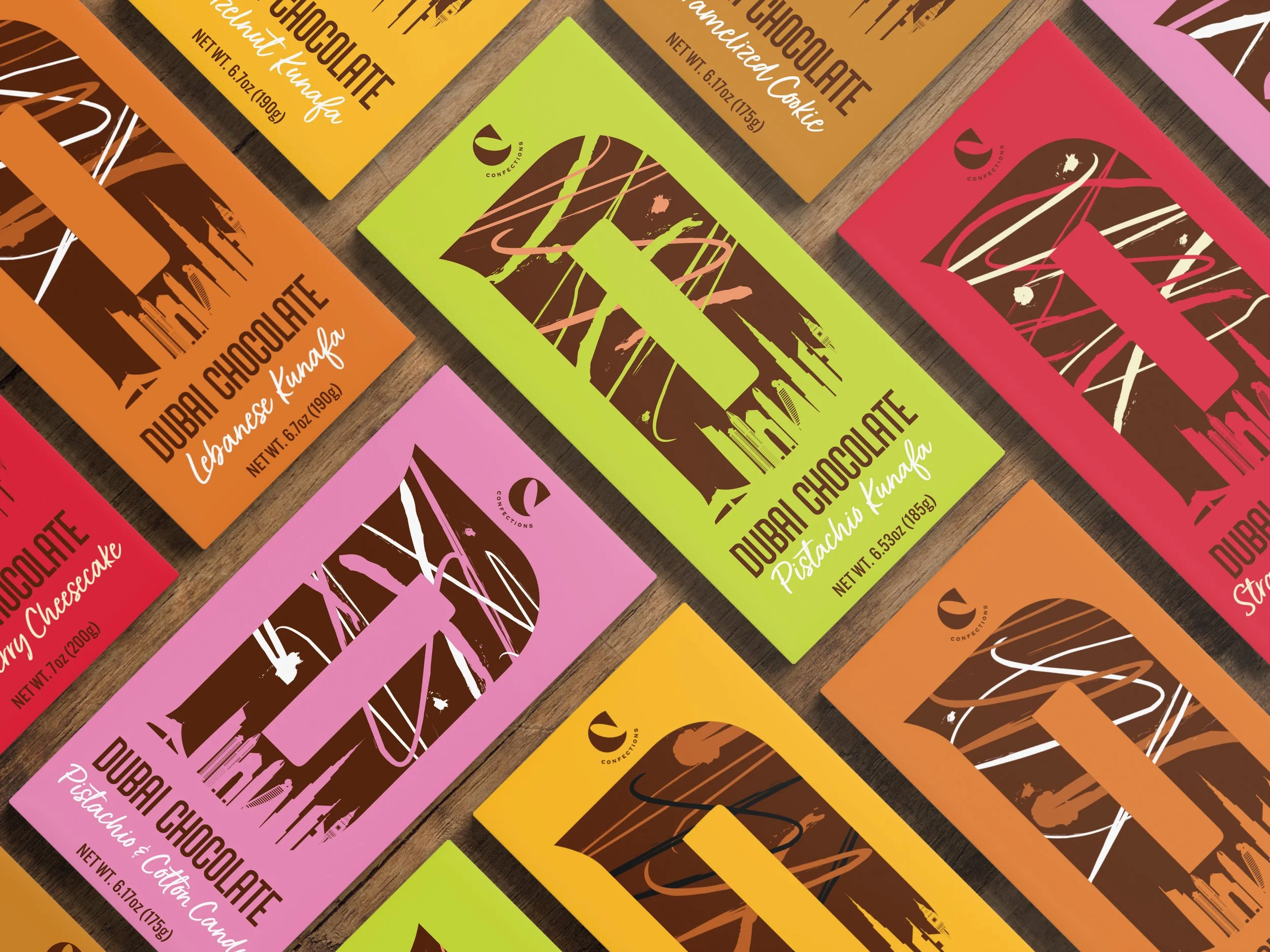
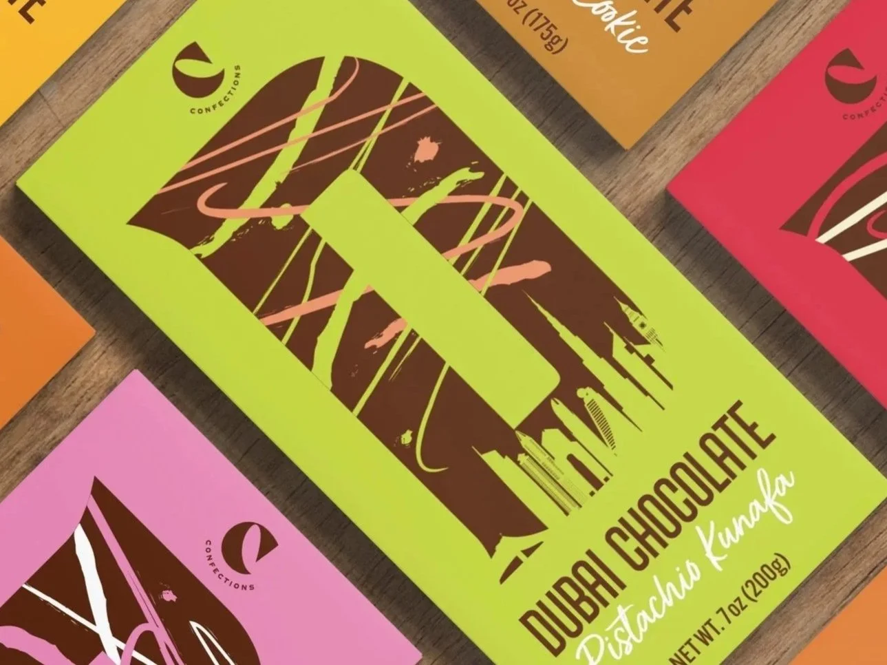
Crumble's Dubai Chocolate

1
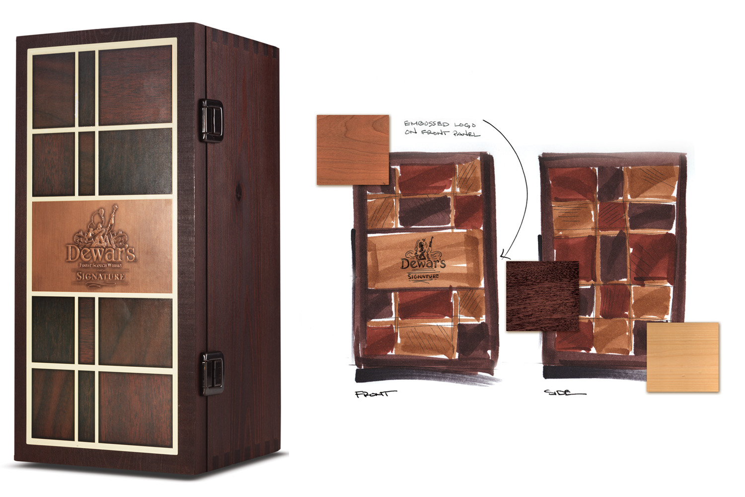
Dewar's Signature
2
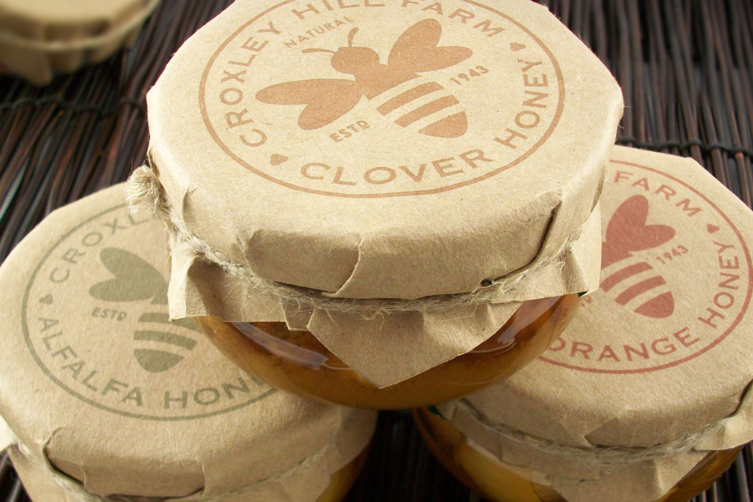
Croxley Hill Farm

2
Sprouts Household Cleaning

1
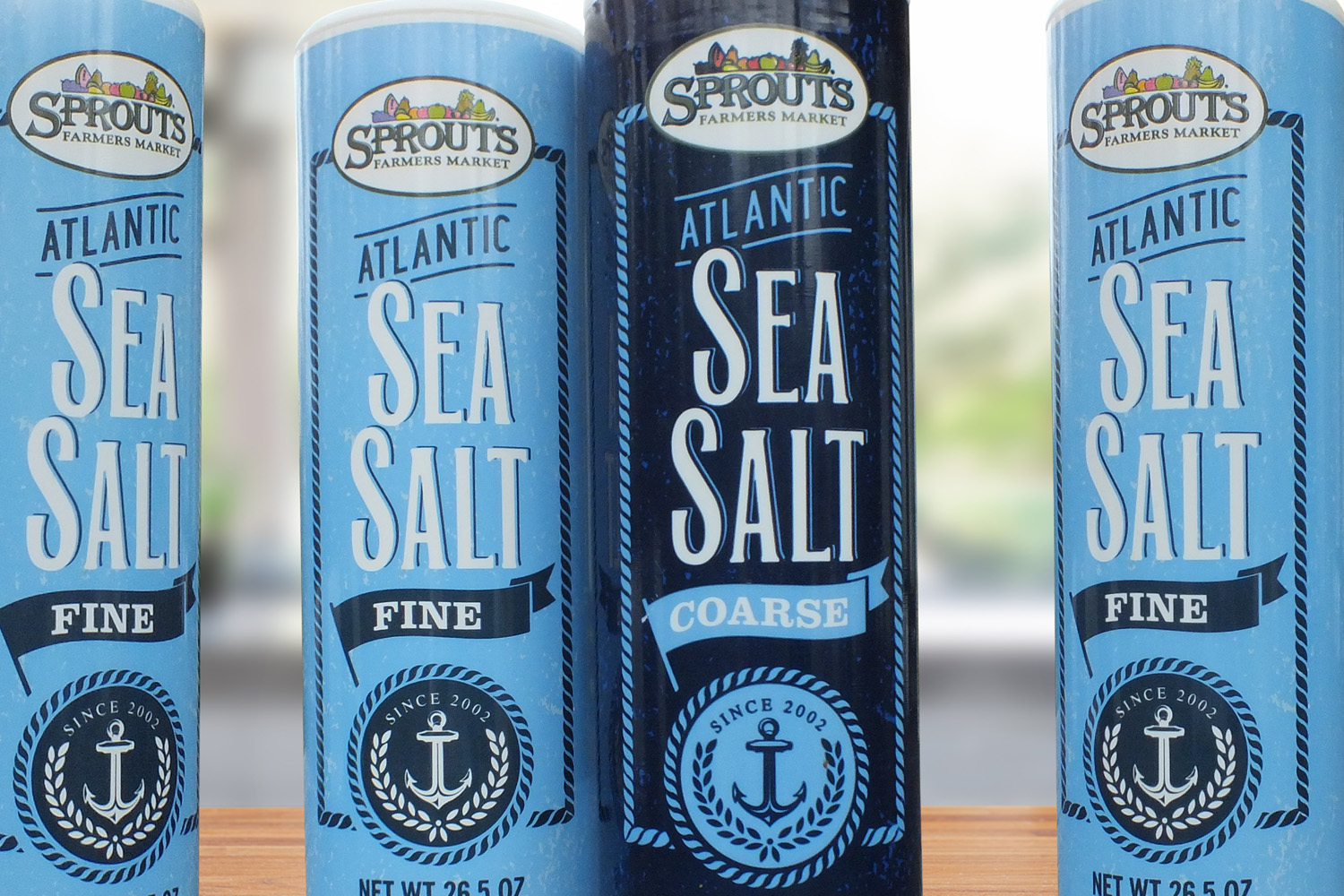
Sprouts Sea Salt

2
PerioPredict

1
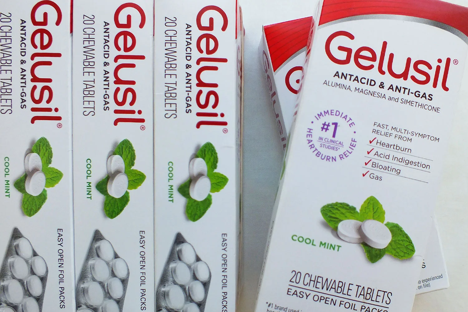
Gelusil Tablets

3
Bath & Body Works BIO
3
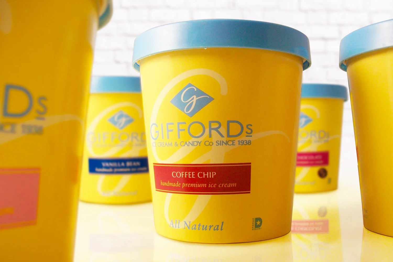
Giffords Ice Cream & Candy

1
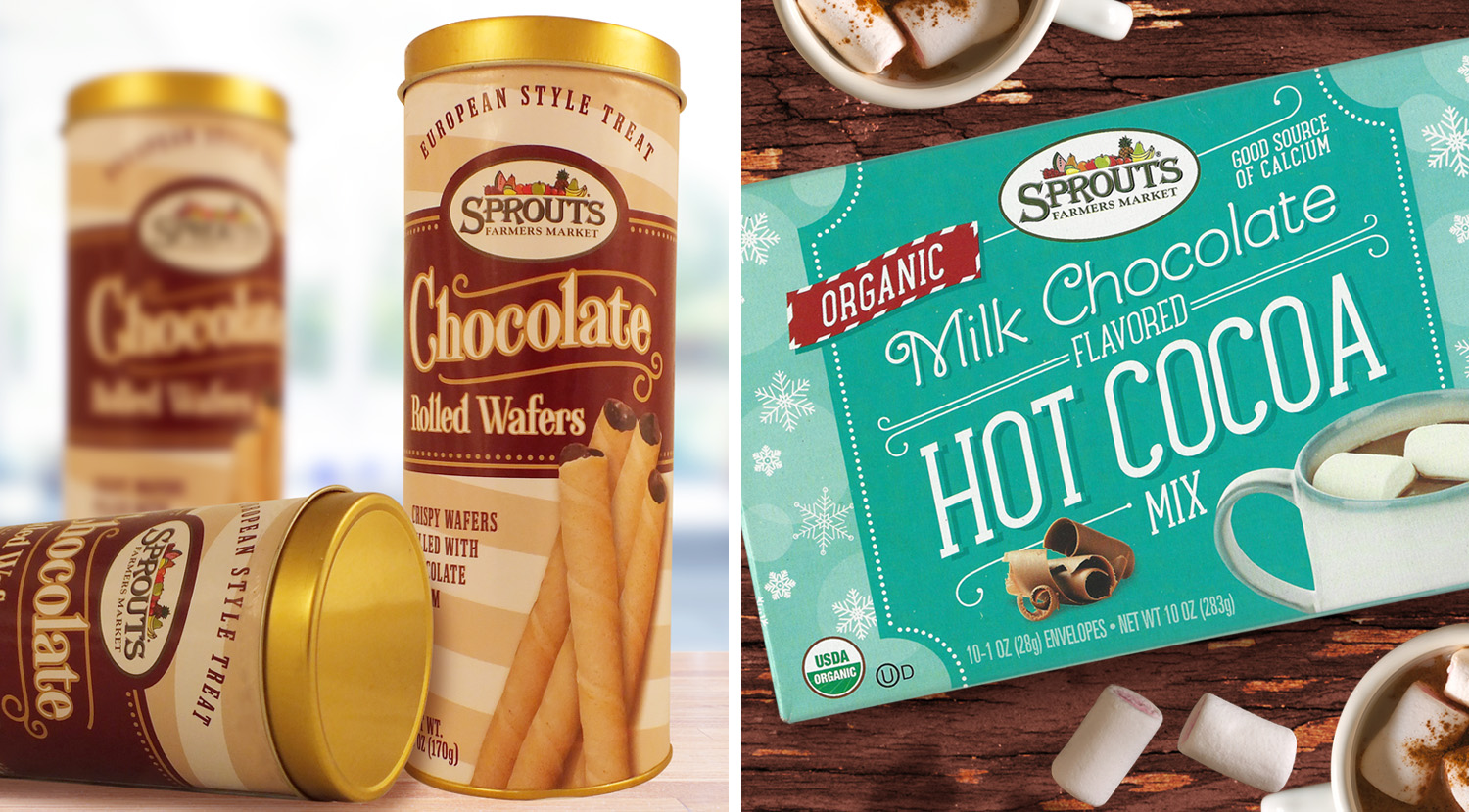
Sprouts Chocolate Wafers & Hot Cocoa Mix
1
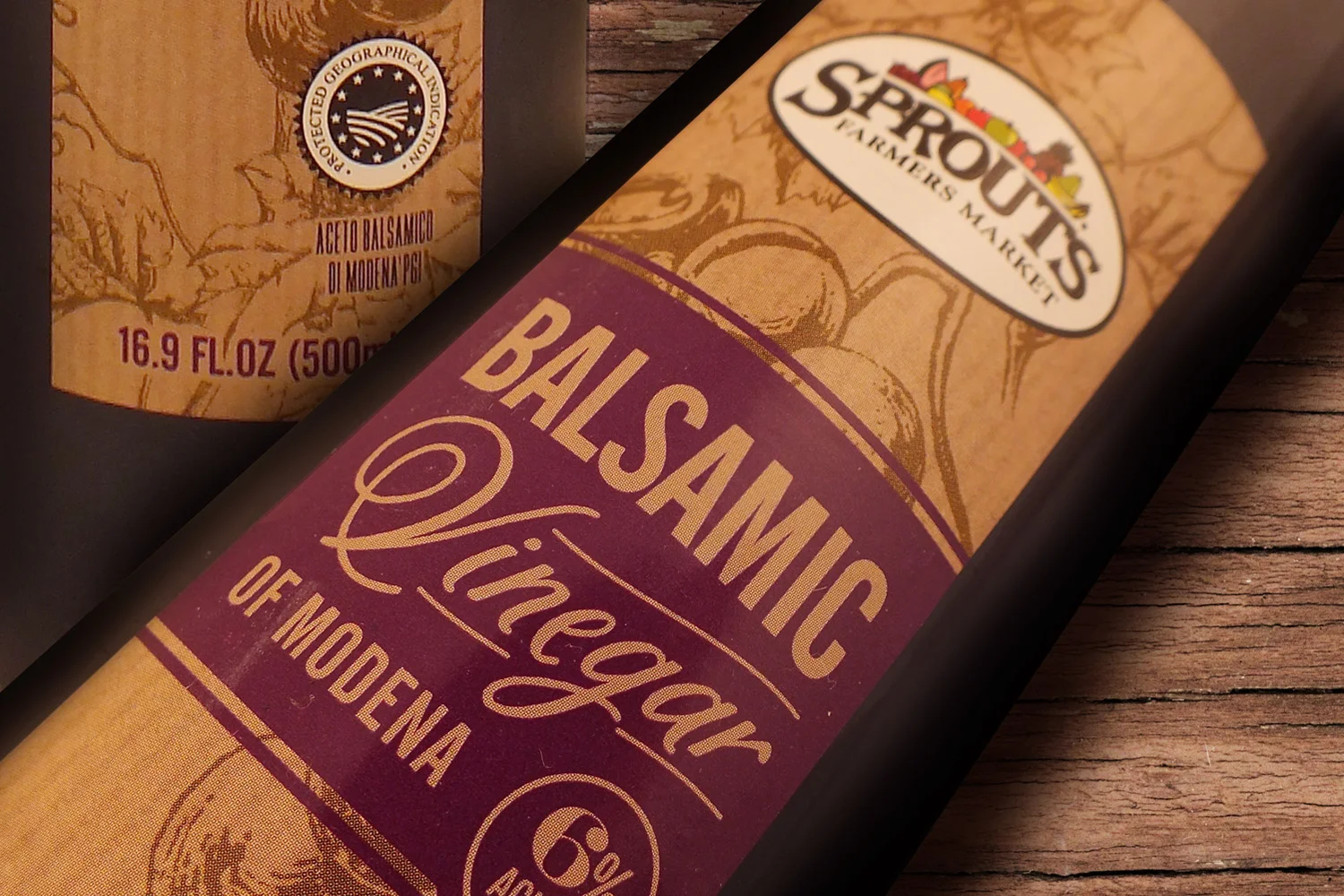
Sprouts Balsamic Vinegar

2
Opus Gelato & Sorbet

1
Kashi GoLean Waffles